BISCUITVILLE PACKAGING DESIGN
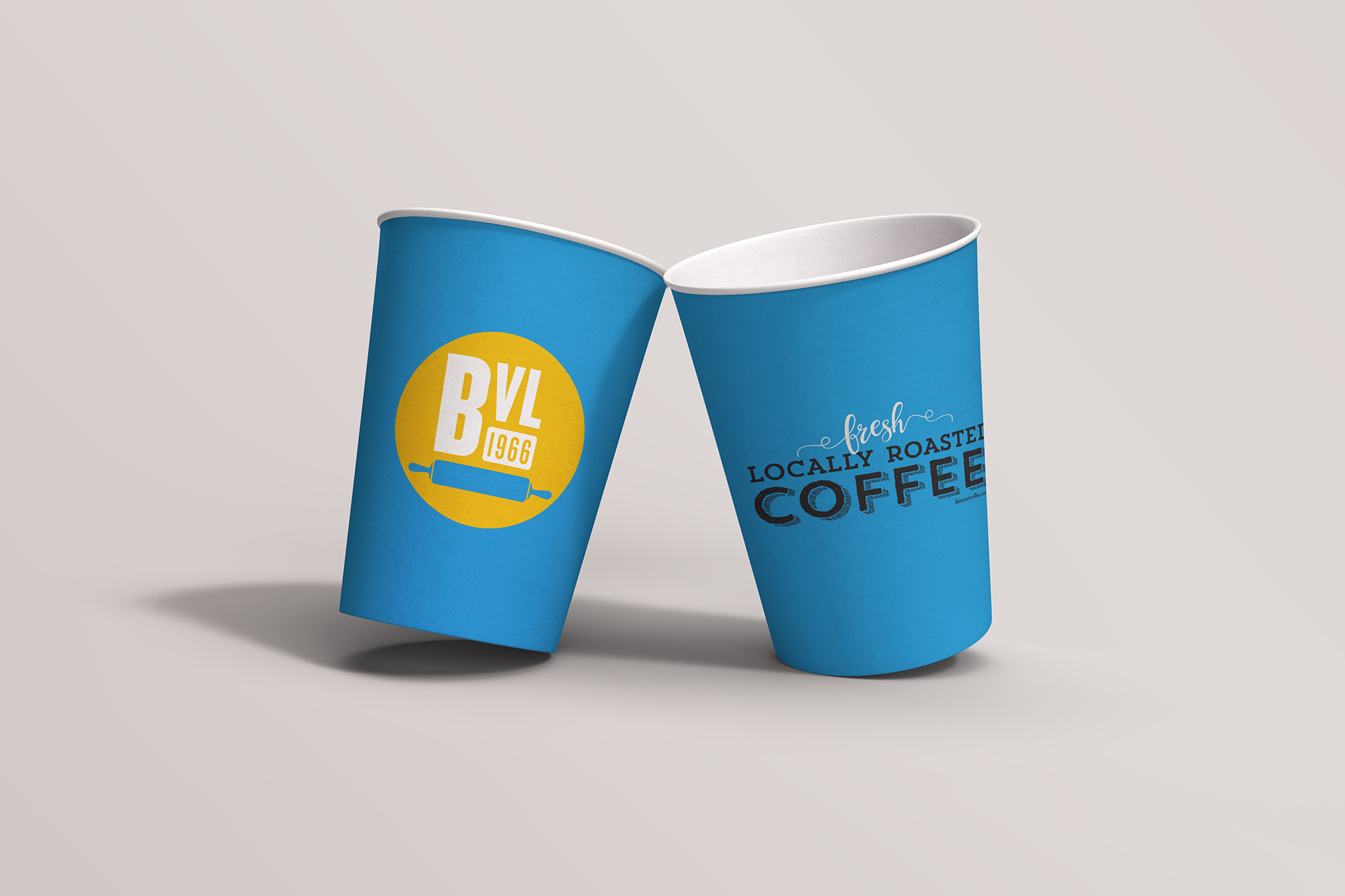
Coffee Cup Packaging
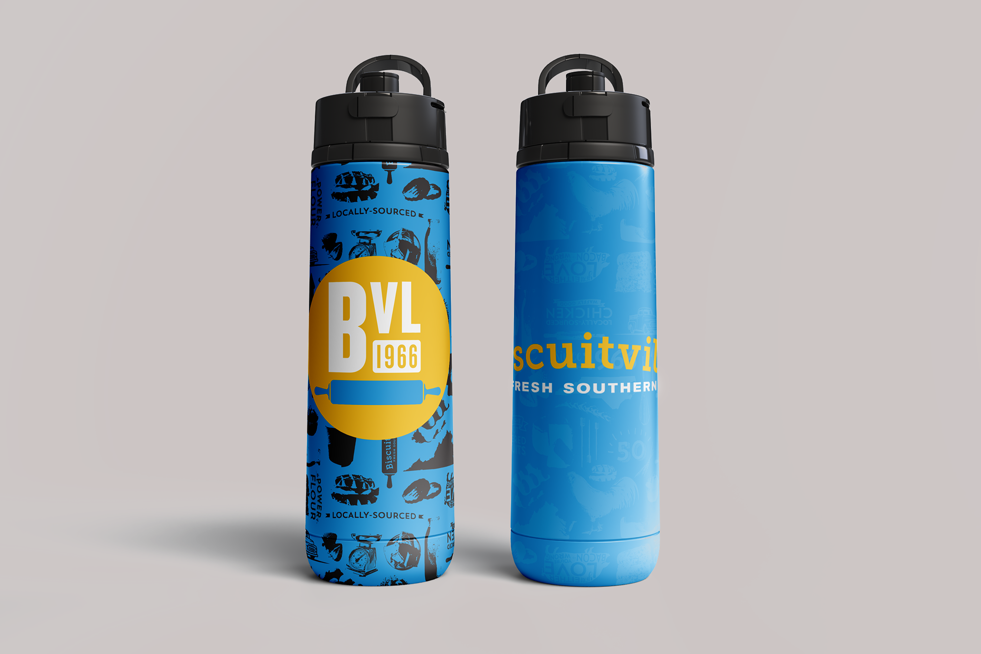
Drink Cup Packaging
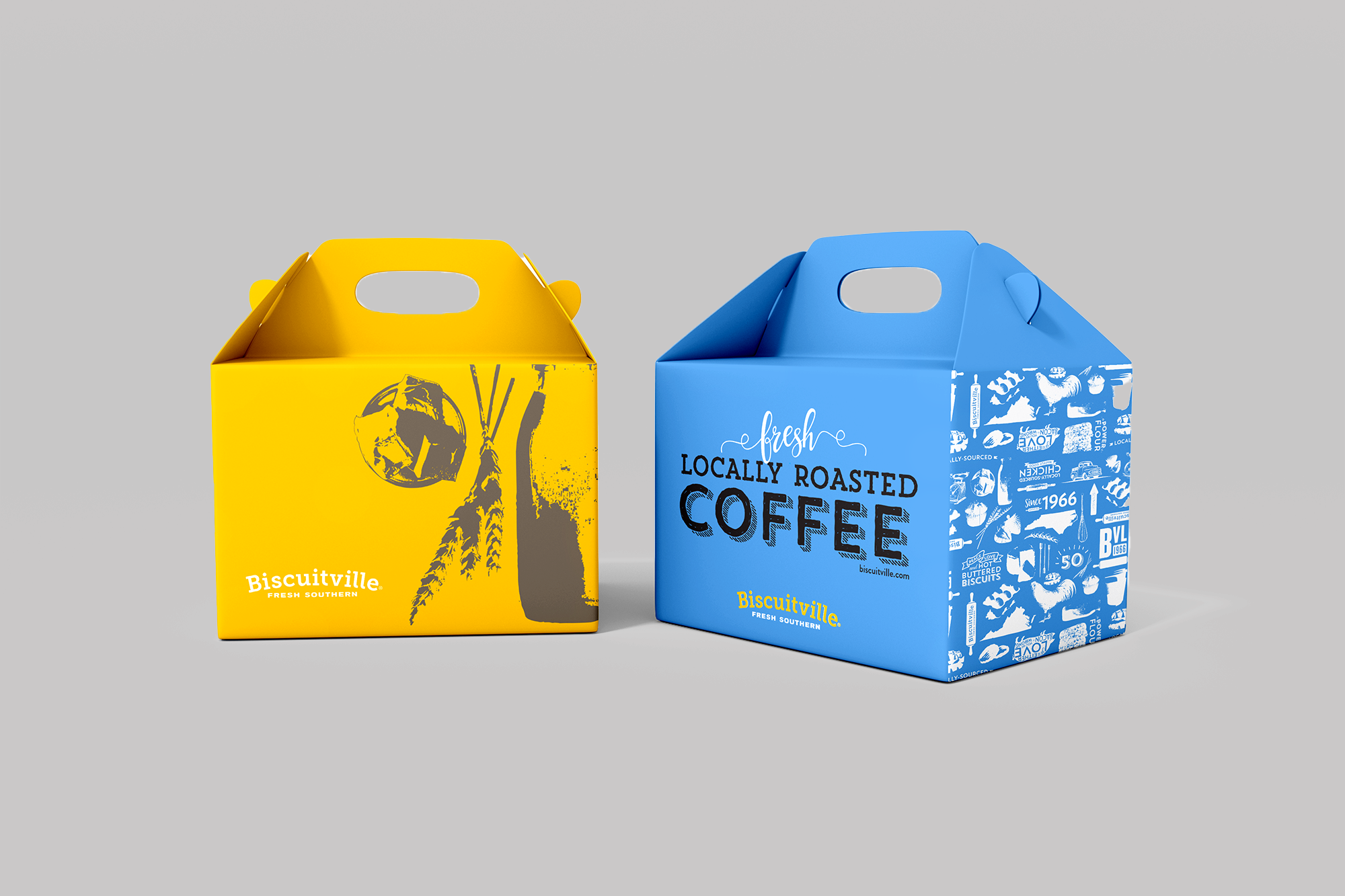
Food & Beverage Box Packaging
Large Food Bag Packaging
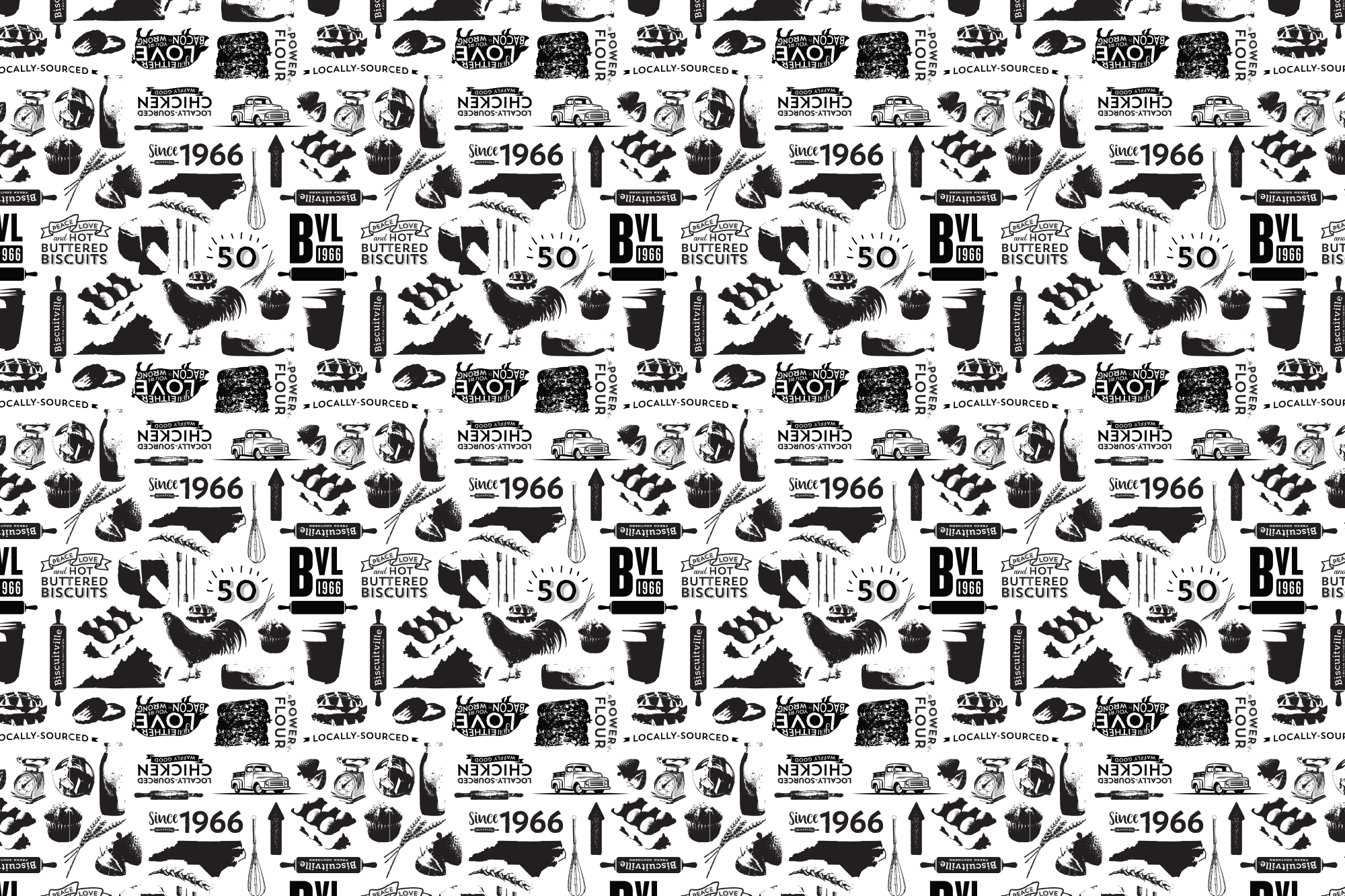
Product Visual Design
Biscuitville Packaging, Merch & Pattern Graphic Design
Coffee Cup Packaging
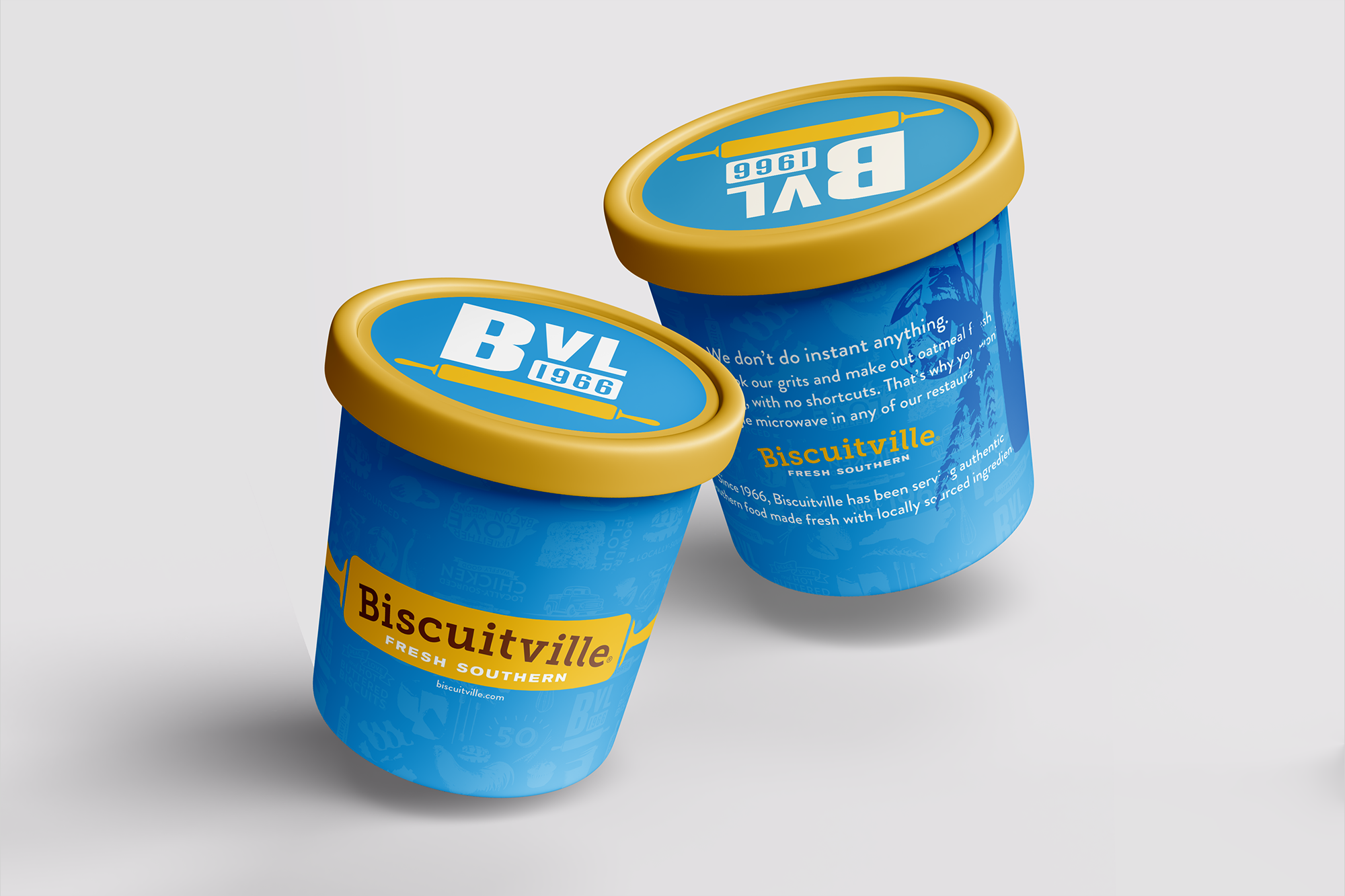
Oatmeal & Grits Cup Packaging
Catering Bag Packaging
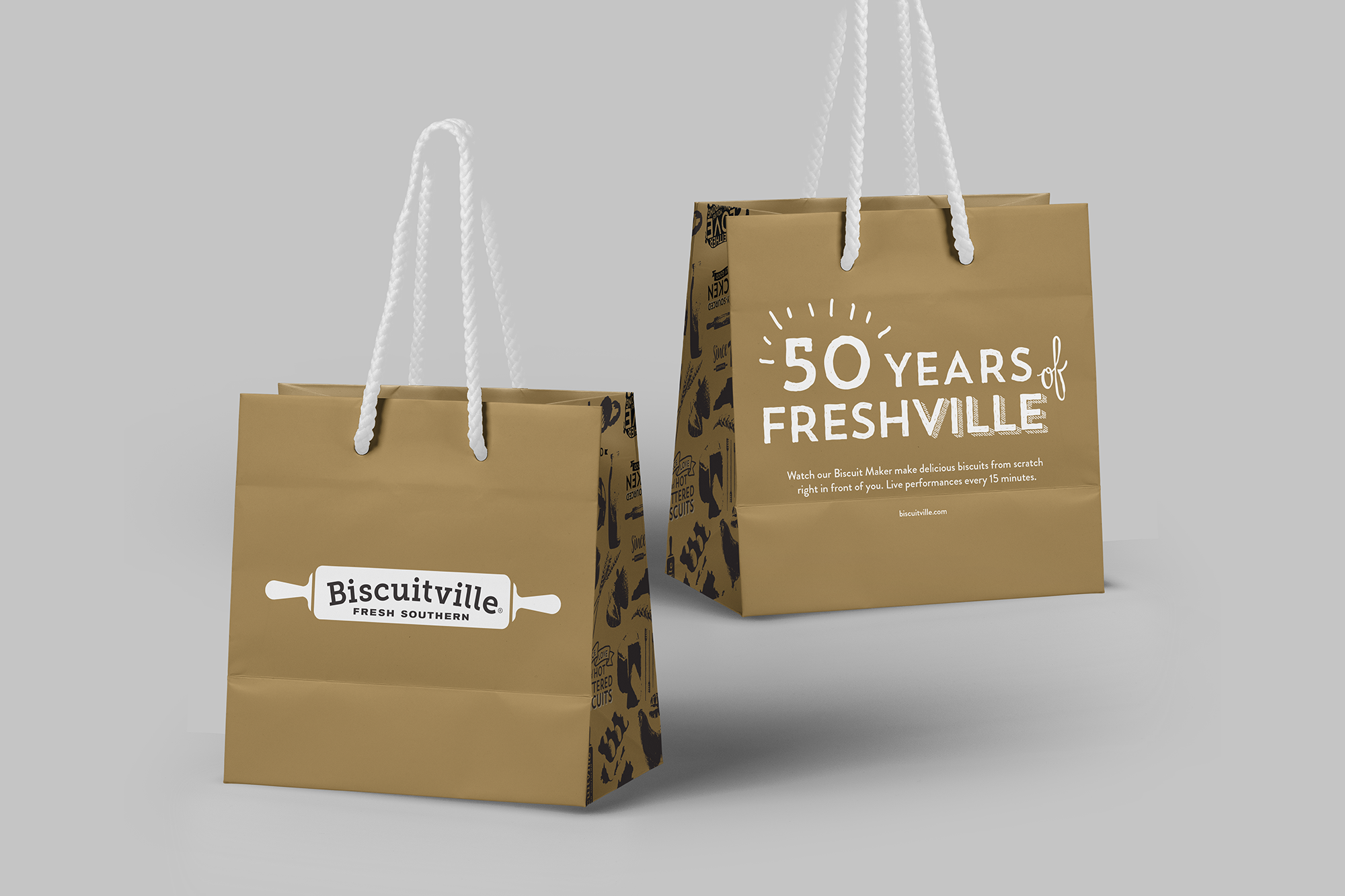
Small Food Bag Packaging
Product Visual Design
Biscuitville, founded in 1966, is a southern style fast-food breakfast restaurant with locations originally in Virginia, expanding now to North & South Carolina and Tennessee. Priding themselves on ingredients sourced from local farms and family-owned partners, Biscuitville was committed to their packaging preserving this historic and home-grown feel in an updated, modern style.
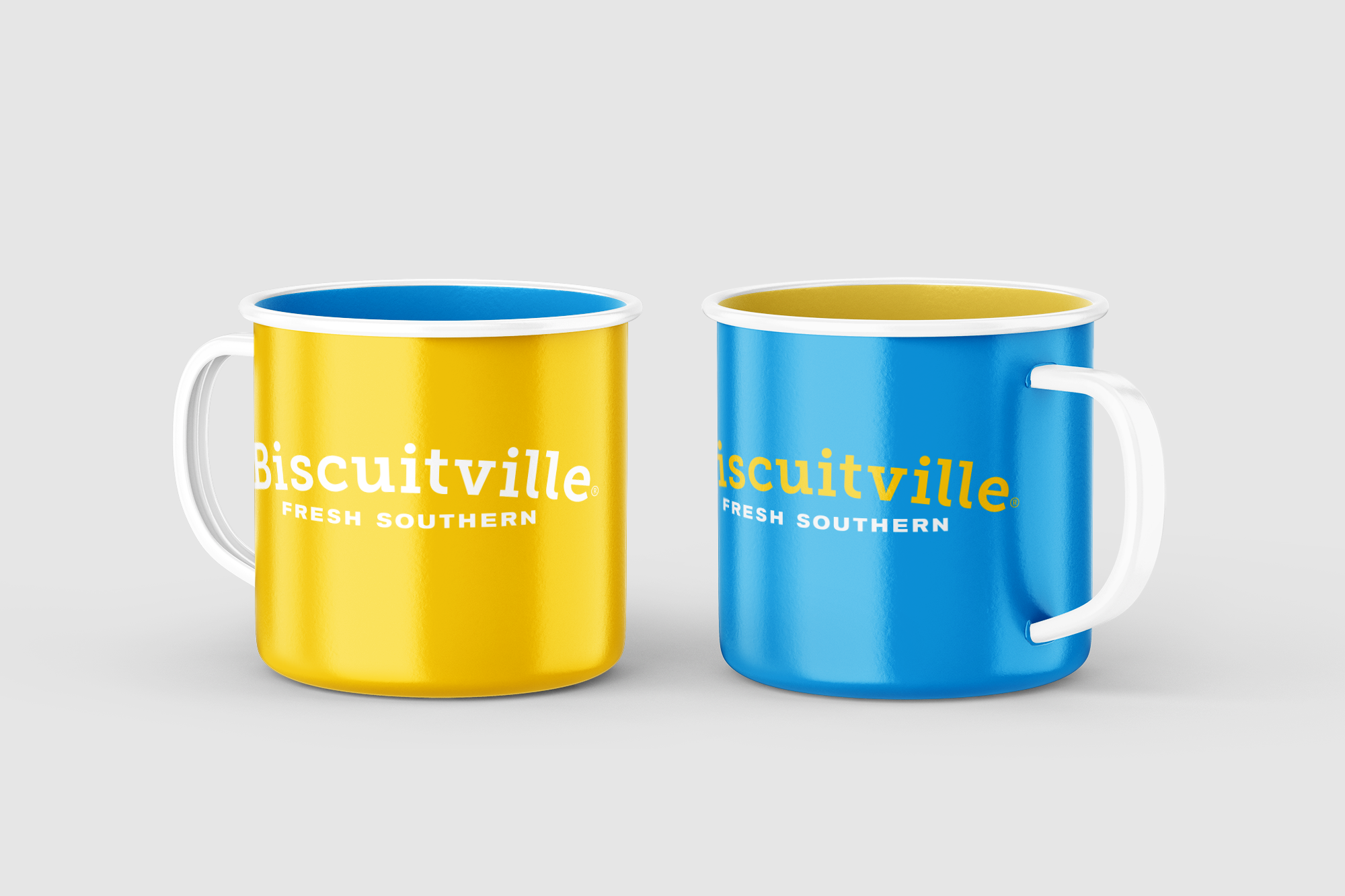
Moving away from the original palette of brown and yellow to yellow and blue helped to reflect a more energetic brand personality as well. Because Biscuitville has food and beverage products, each deserved its own packaging style/feature/specific visual element. To visually distinguish between the two, food packaging features the rolling pin logo and biscuits with corresponding ingredient imagery, while the beverage packaging utilizes the arched text-only logo and full pattern. To further distinguish between the two, not exclusively though more often, the food packaging leans more on a yellow heavy palette and food the blue.
Biscuitville specializes in delicious southern-style biscuits, which are the foundation of the menu, so it only made sense to use the biscuit imagery as the foundation of the packaging design and pattern. The pattern created for the packaging also incorporates imagery from the most important elements of the brand in an illustrative style eliciting a sense of hand-touched care. These brand elements include the state shape of Virginia, the original location of Biscuitville, locally sourced ingredients and kitchen tools.


