RED MOUNTAIN REBRAND & WEB DESIGN
Red Mountain Motel and R.V. Park rebrand and web design.
Logo
Signage
Signage
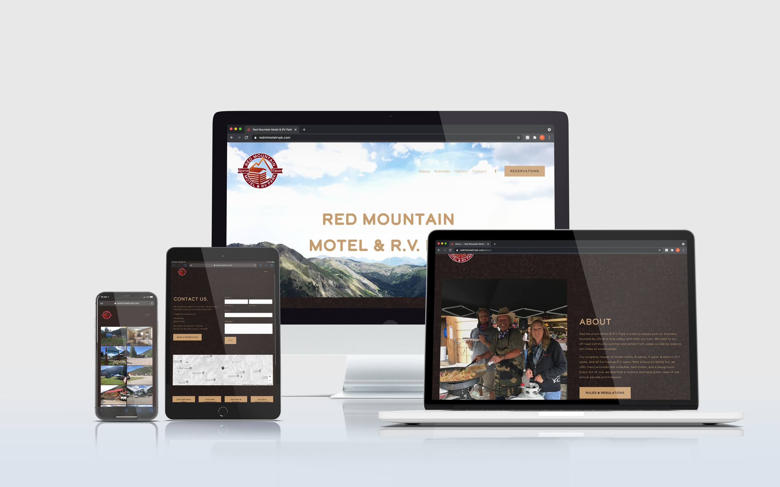
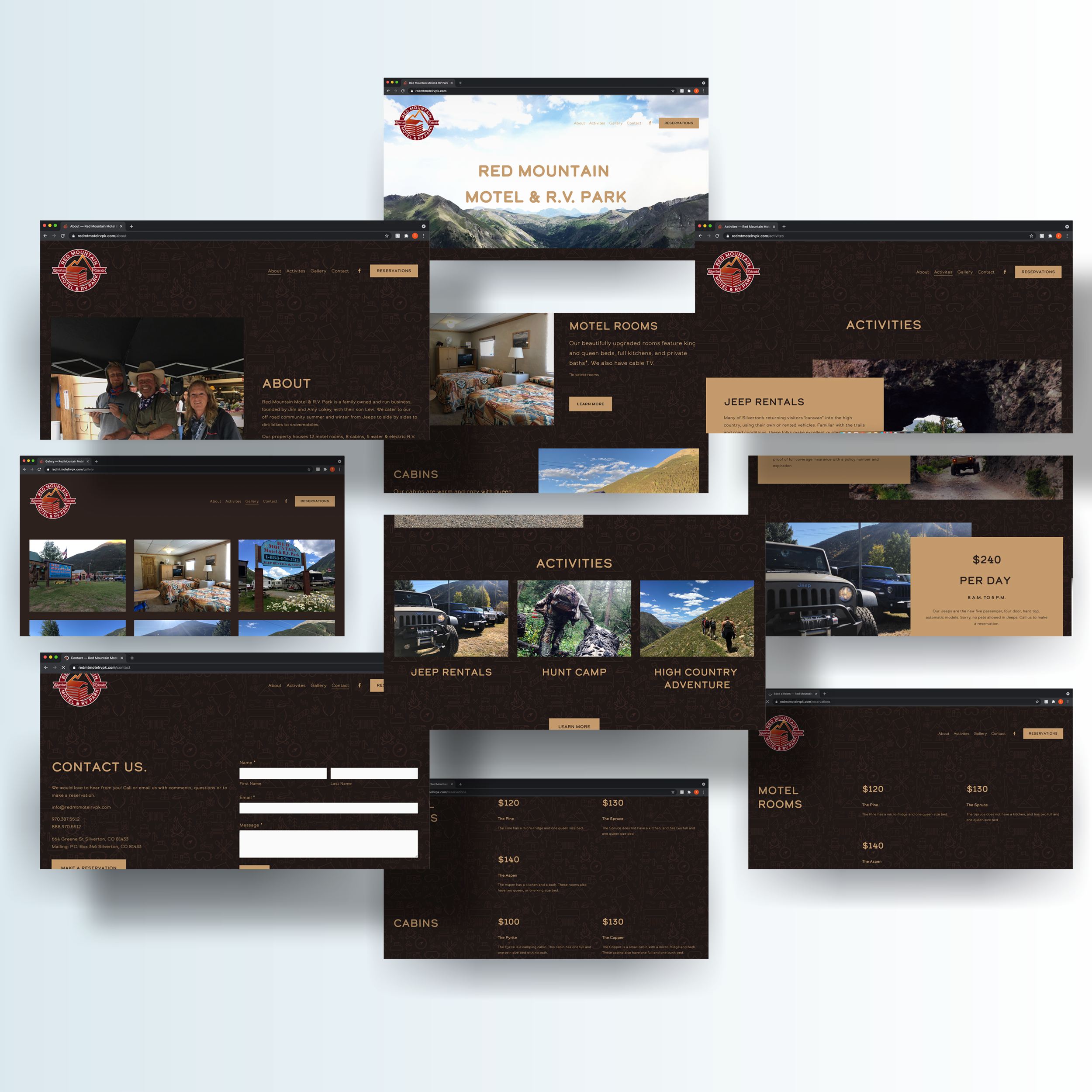
Check out the site: https://www.redmtmotelrvpk.com/
Brochure
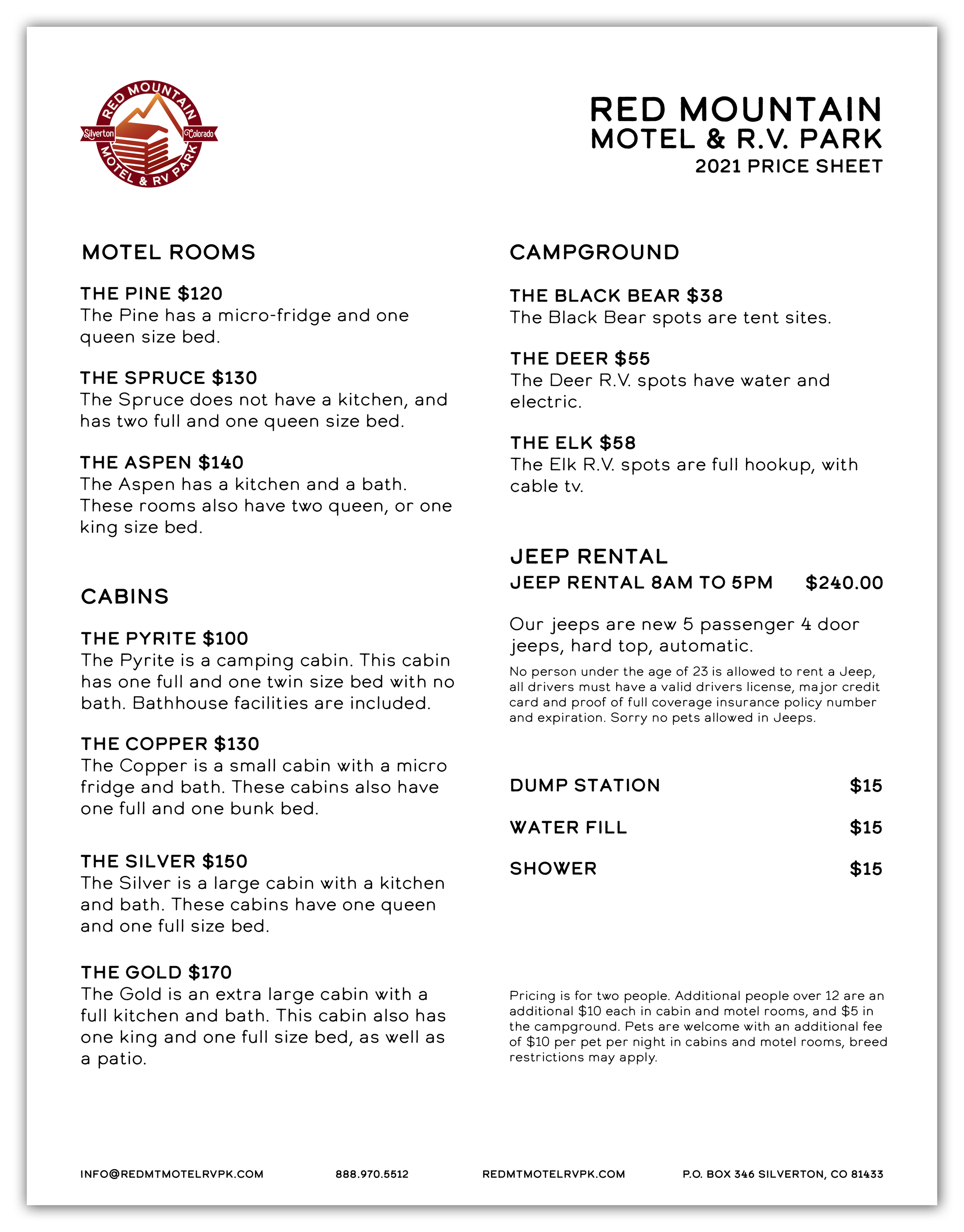
Price Sheet
Rules & Regulations
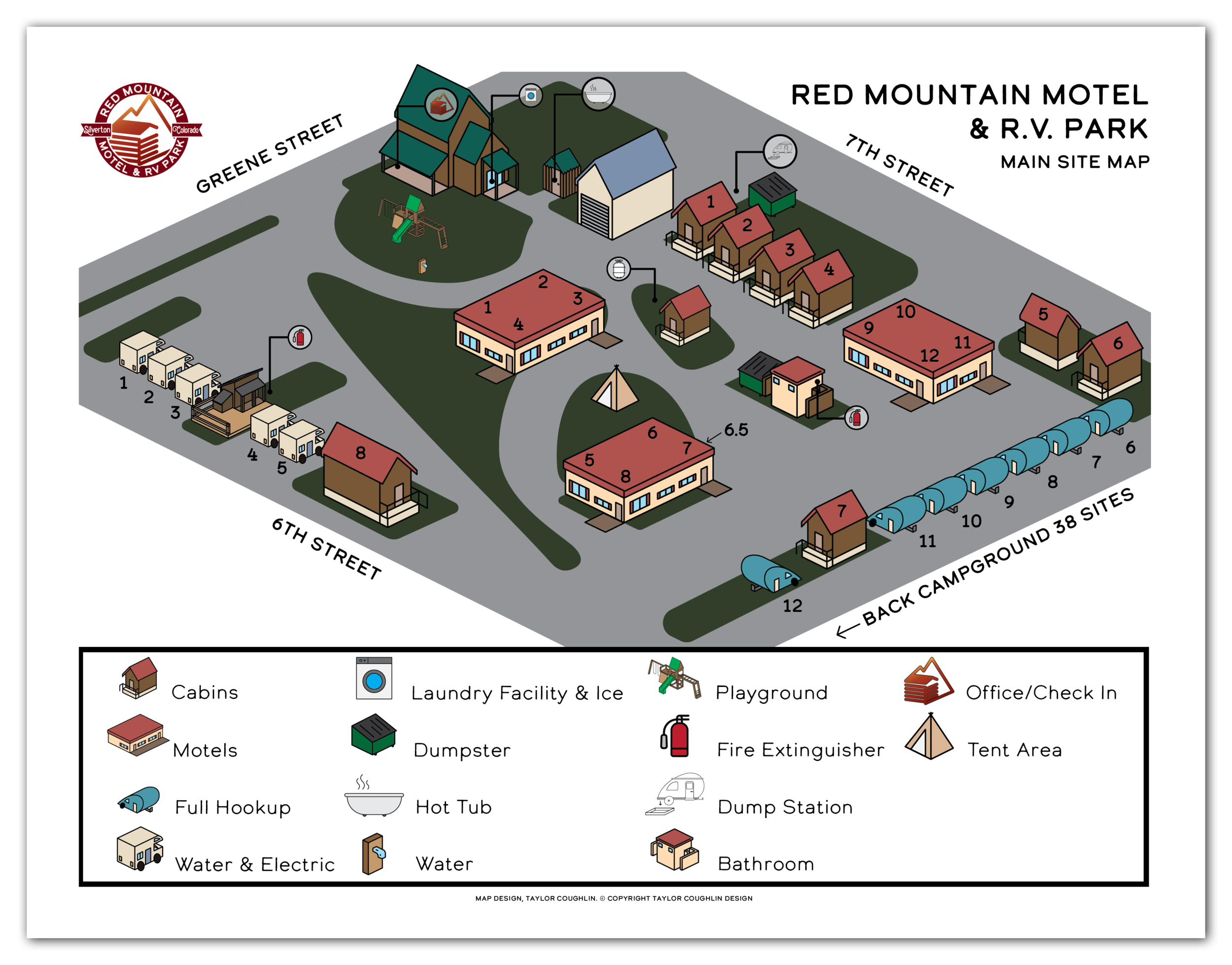
Main Site Map
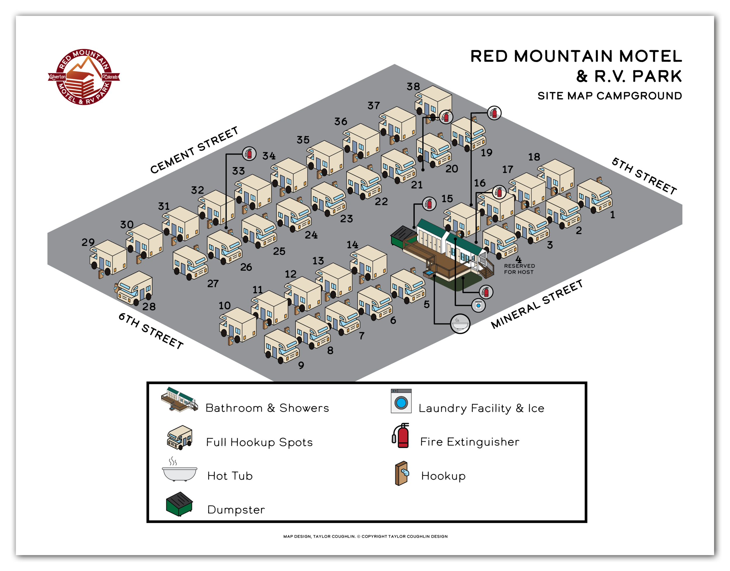
Campground Map
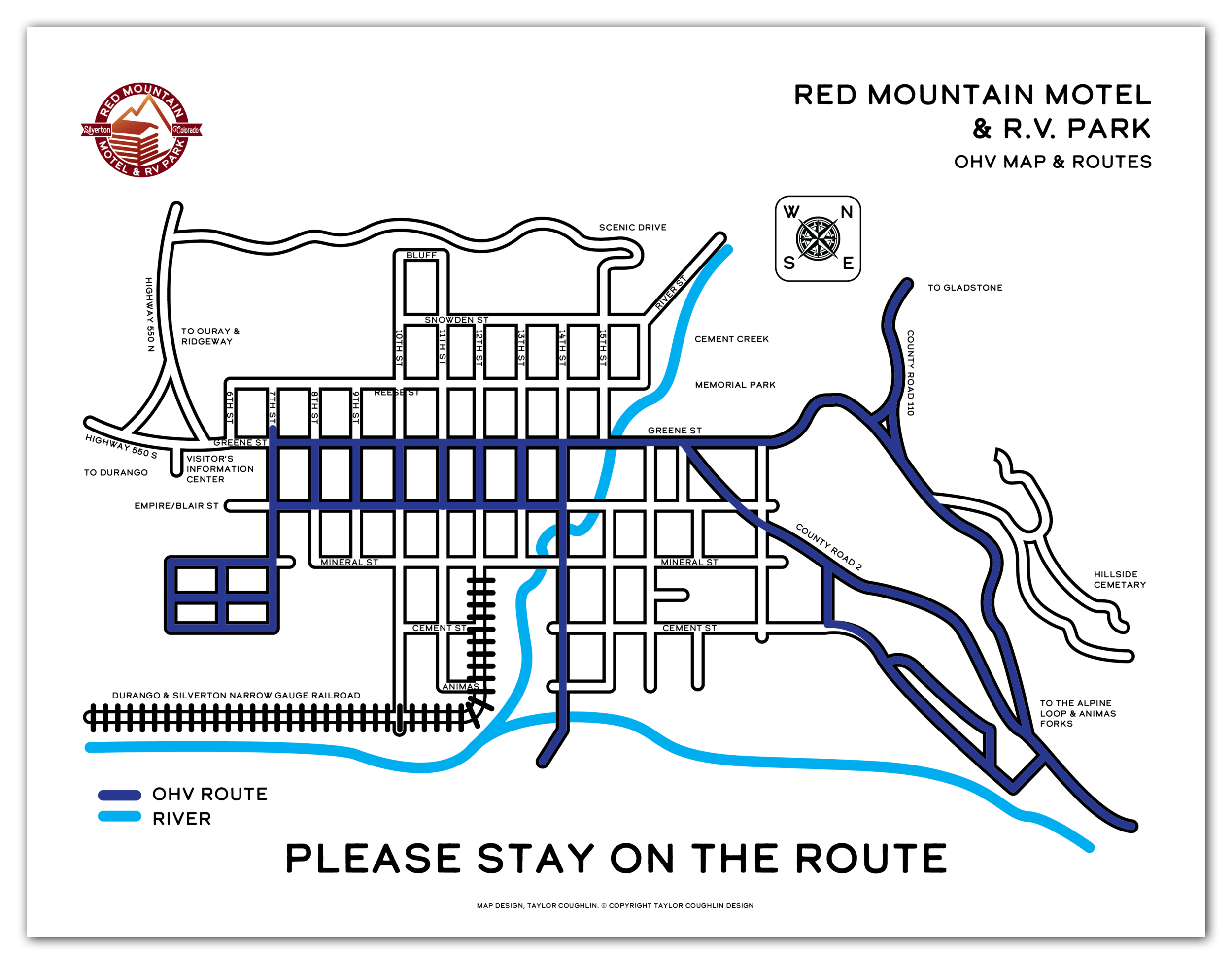
OHV Route Map
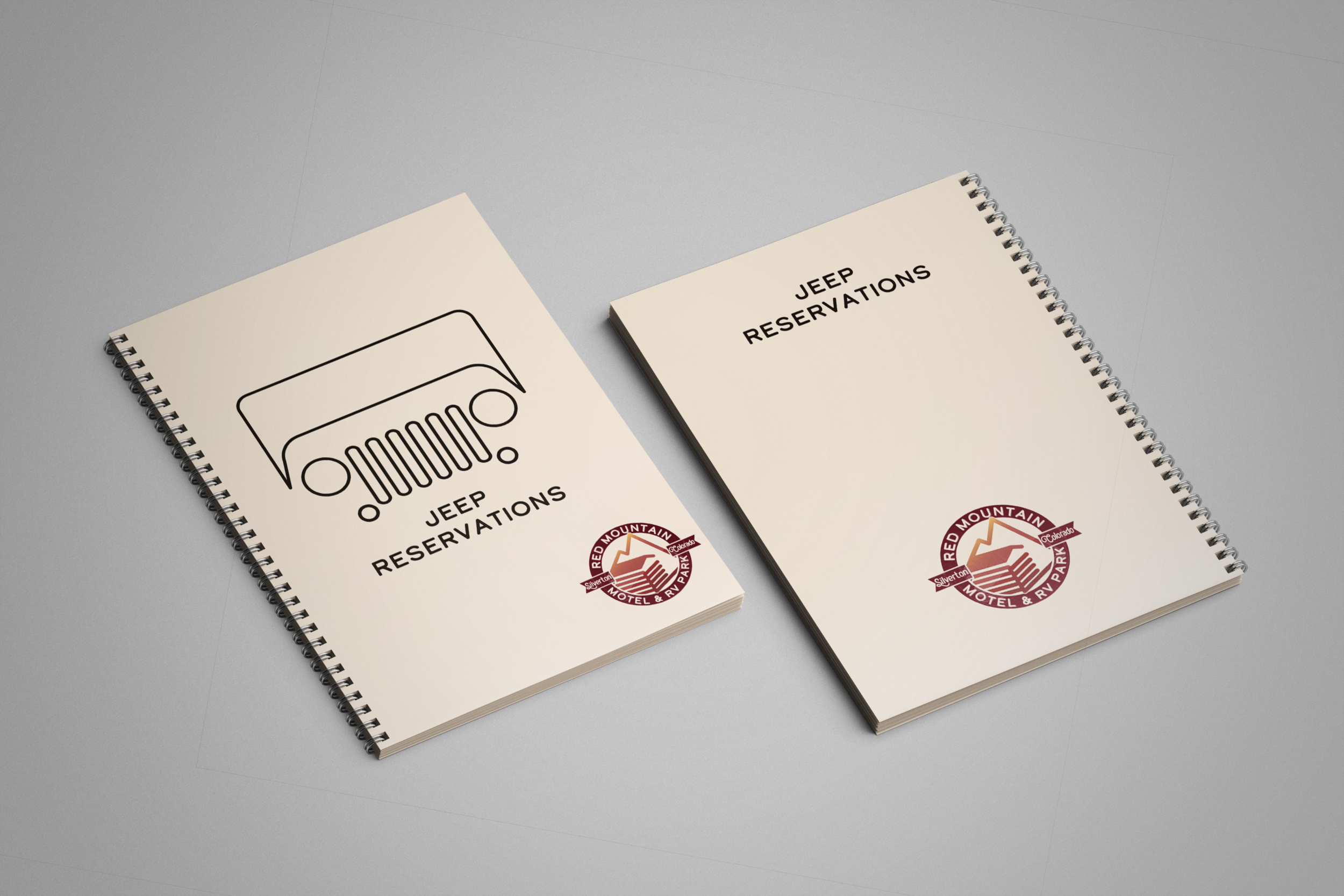
Reservation Book Covers
Reservation Book Inside Pages
Red Mountain Motel & R.V. Park is a family owned and operated business catering to the off road community for both summer and winter recreation. From Jeeps to side by sides to dirt bikes and snowmobiles, there is something for everyone. The property houses motel rooms, cabins, water & electric and full hookup R.V. spots. With a focus on family fun, they offer many activities like volleyball, bad mitten, and a playground. Every 4th of July, they also host a cookout with great views of the annual parade and fireworks.
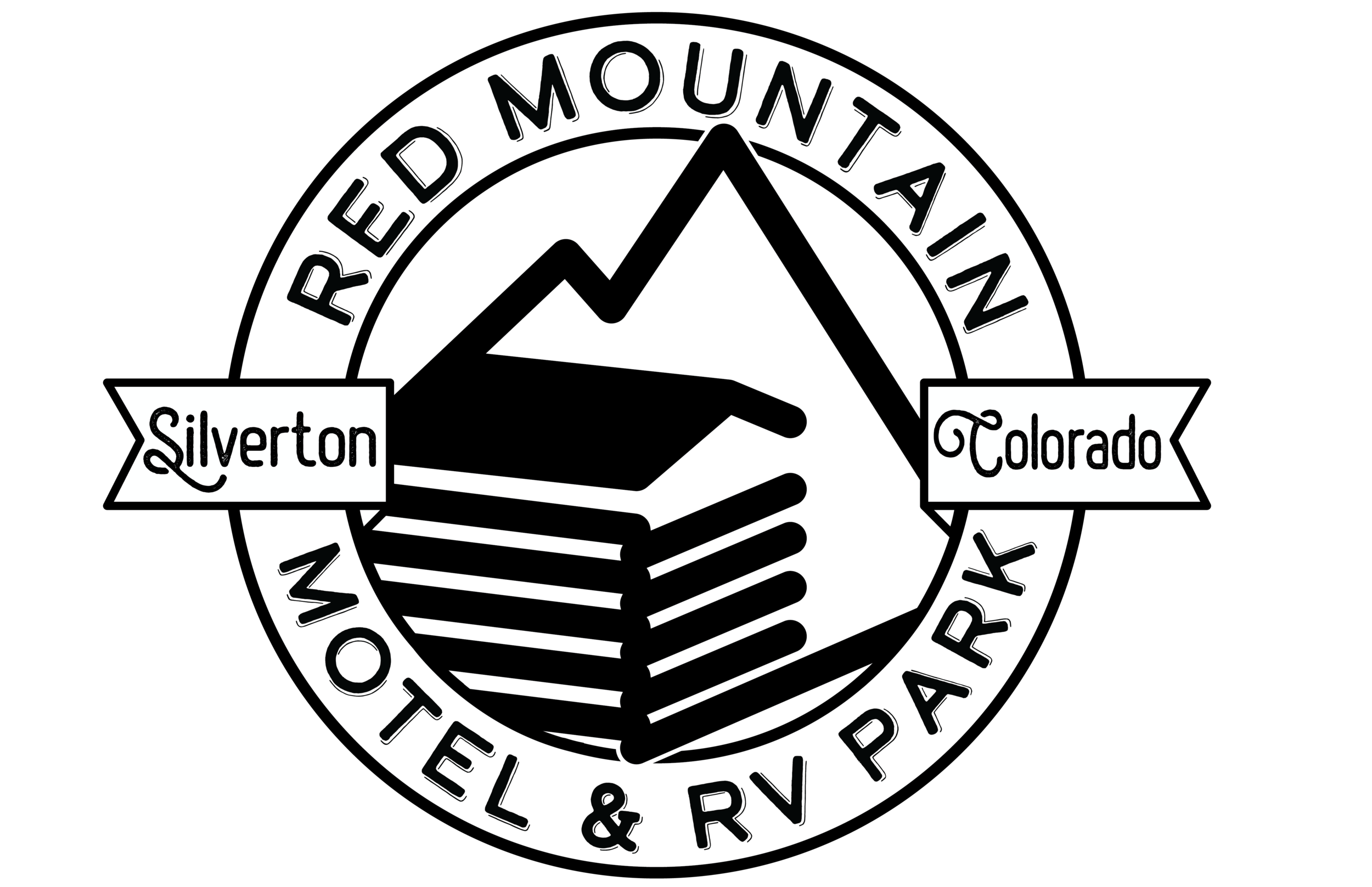
The logo symbol was inspired by Red Mountain, where the business is located in Silverton Colorado, as well as the beautiful log style cabins housed on the property. The badge style circle composition I chose to fit the campground outdoorsy community and town the business caters too, and is a part of.
Combining the two logo elements, the circle banner and mountain and cabin, I created the final logo.
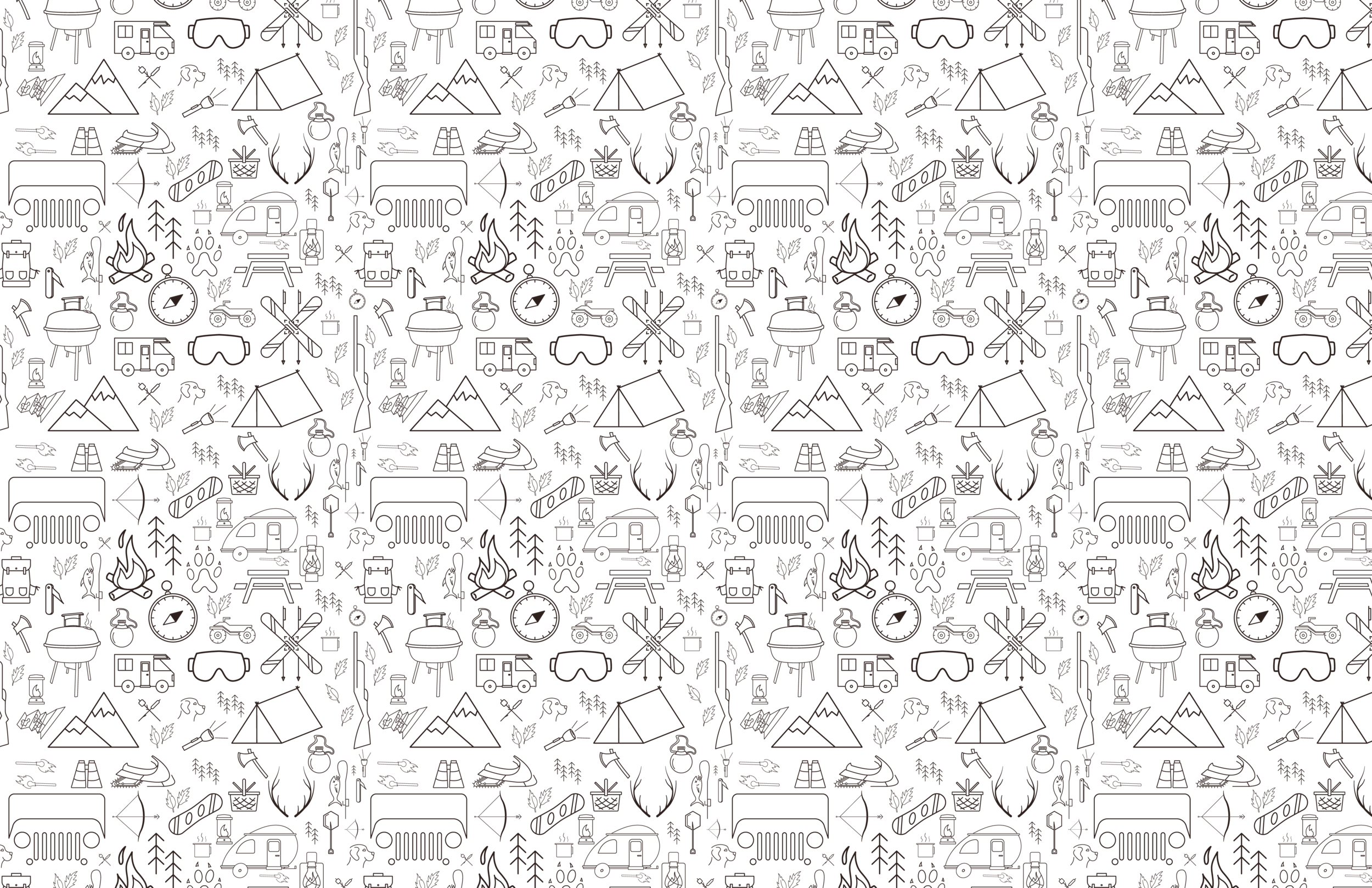
When creating the pattern for Red Mountain Motel & R.V. Park, I chose to include key elements of the business, from amenities to activities to the landscape. This pattern communicates what Silverton Colorado has to offer, as well as what the business offers.
Since Jeep rentals are one of their biggest attractions, it is one of the bigger elements in the pattern. There are many spacious tent, r.v., and camping trailer spots available on the grounds, which are also featured in the pattern as they are an important attraction for the campground. Some of the smaller elements in the pattern feature a few of the popular recreation atractions visitors can take part in at the campground and within the town and surrounding land. This includes skis, a snowboard, snowmobile, atv, bow & arrow, hunting rifle, and more.
Pattern
Pattern with Background
The color palette was inspired by the name of the mountain the business is located in, Red Mountain in Silverton Colorado. The brown tones give an earthy feel to the brand that reflects the setting of the campground.
The typefaces I chose give a bit of a rugged feel that compliments brand, and also has a softer side in the body copy that feels welcoming and friendly. This exemplifies the brands focus on family fun and outdoor recreation.
Original Site, Maps, and Branding


